
U!Scientist at the Adler Planetarium
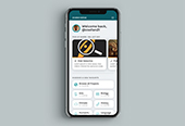
Thanks to a grant from the National Science Foundation, I created an in-gallery multi-person touch table experience for Zooniverse, the world's largest people-powered research platform.
The experience, based on Galaxy Zoo, encourages museum guests to learn about galaxies while contributing to real scientific research: by making classifications in the experience, they help astronomers "unlock" their data in order to study galaxies and the Universe writ large. Over the course of about a year, I designed, prototyped, and oversaw the construction of this exhibit, which was installed in the Adler Planetarium's Solar System Gallery in August 2019. An academic paper detailing the design process and results of a video and naturalistic study is forthcoming.
Project Category
Web Design
Logos & Branding
Exhibit Design
—
Role
Visual Design
Creative Direction
UX Design
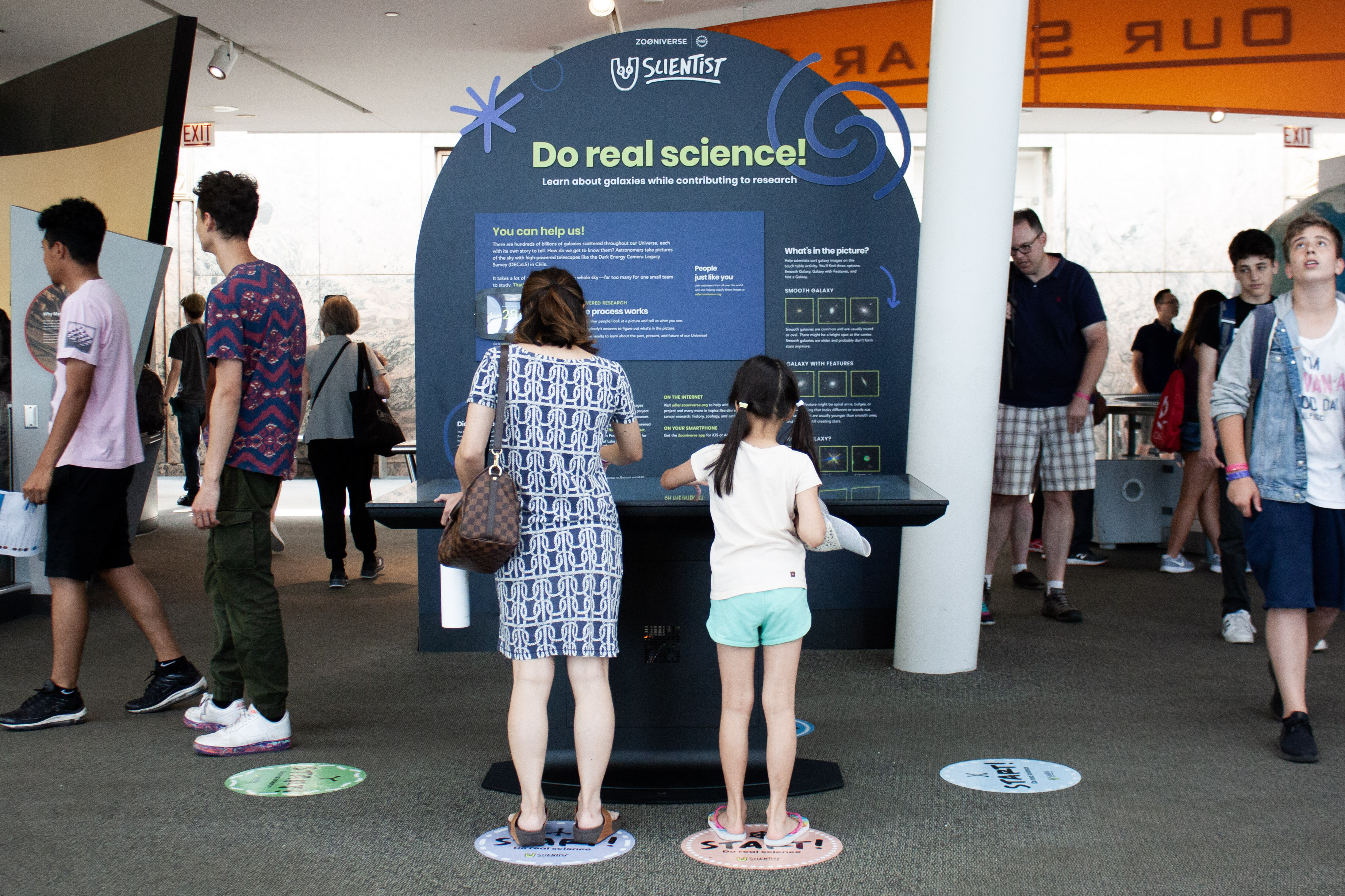

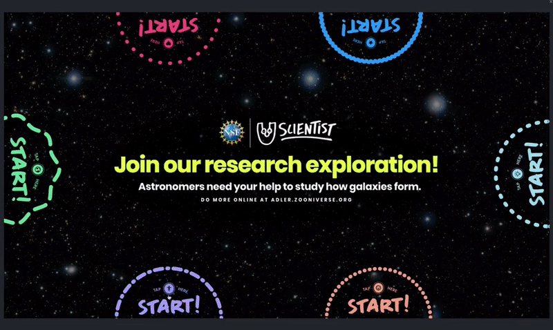

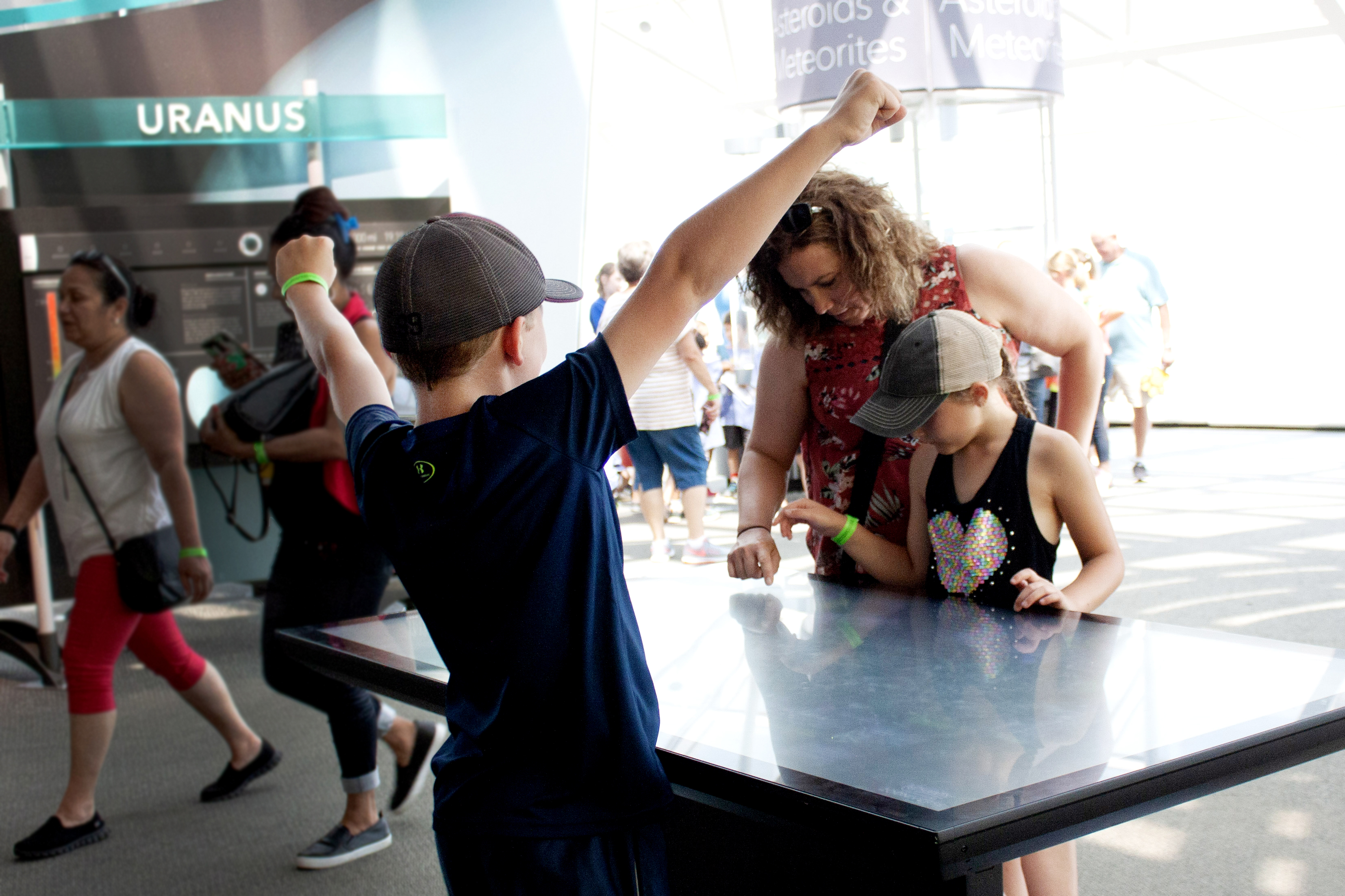
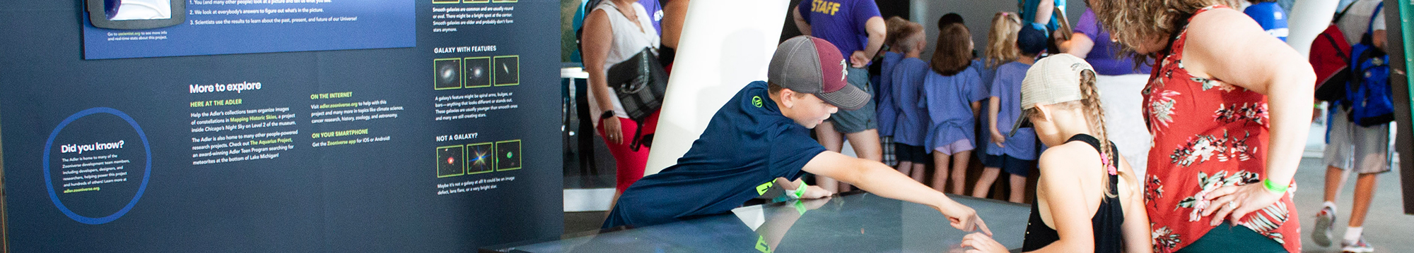
THE INTERFACE: Six separate workstations allow many guests to interact at once. In the experience, guests look at images of galaxies from the Sloan Digital Sky Survey (SDSS) and decide whether the galaxy is smooth, spiral, or not actually a galaxy. Not sure? No worries: 25 people vote on each image, and the consensus decision is sent to the research team. Learn more about how Zooniverse works →

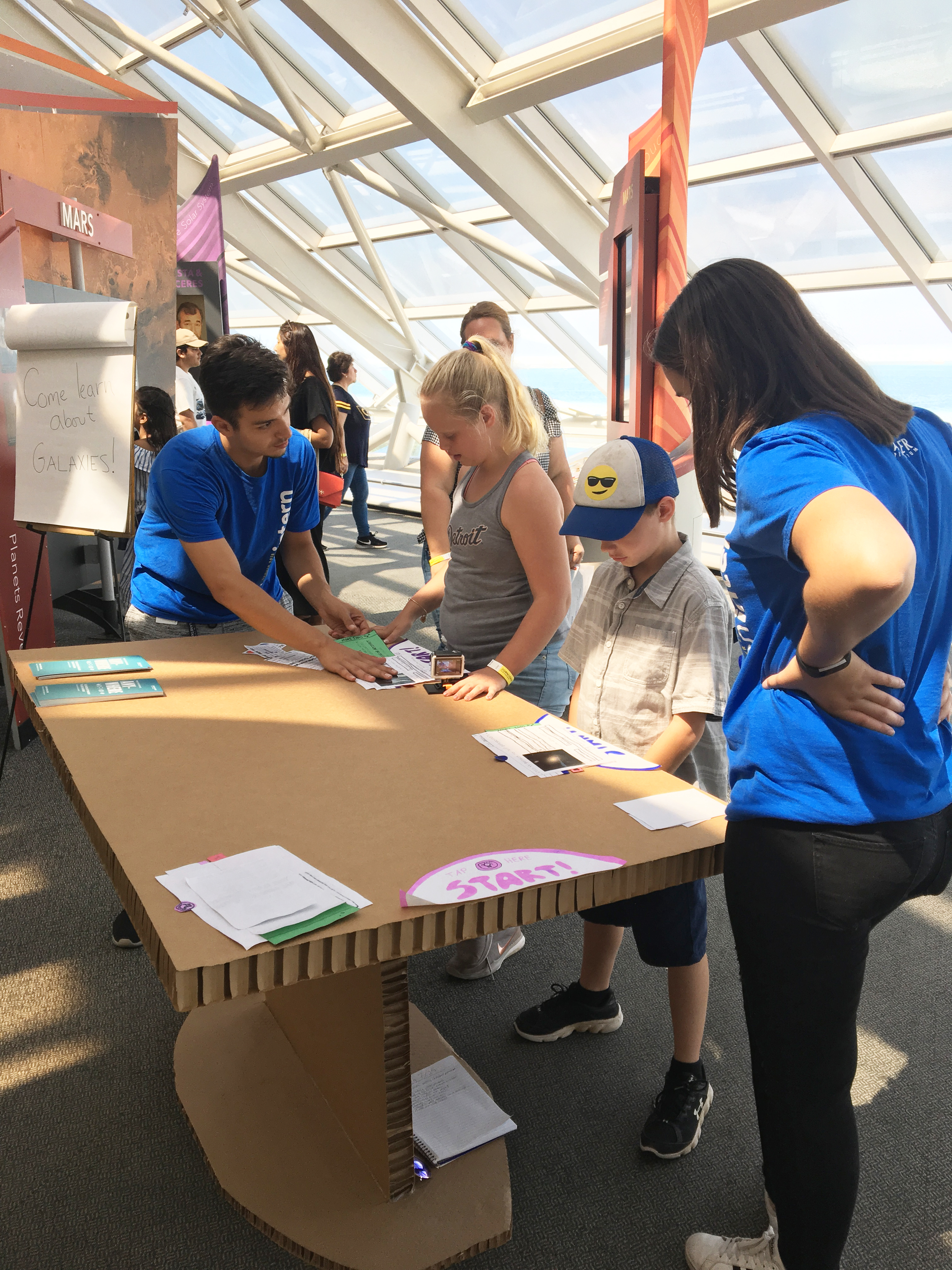

Prototyping with museum guests
The Adler's exhibits team constructed a full-size cardboard replica of the touch table in order to facilitate extensive paper prototyping. With the help of interns from Adler's Teen Interns program, I tested initial UX, layout, and messaging to ensure that the experience on the touch table would be fun, rewarding, and easy to understand for a broad audience.
Through the prototyping process, we learned that messaging, language, and visual examples are especially important in science communication: The idea of contributing to real astronomy research can be daunting, so providing images and writing to a 5th grade reading level were priorities.
Creating a design system
There is a lot to look at in a science museum like the Adler! Guests typically spend about 30 seconds at an exhibit before moving on, so the messaging and visual design of U!Scientist needed to do a lot in a short period of time: tell guests how to use the touch table application, let them know they were contributing to real research, teach them about galaxy types, and encourage them to visit uscientist.org to learn more.
To ensure that guests have a cohesive experience between the touch table, the exhibit, and the website, I created a design system consisting of type styles, colors, and graphic elements. This living document, created early on in the design process, was instrumental in maintaining the exhibit’s look and feel throughout development and into the promotional phase. Peruse the style guide →
By creating a fun, inviting, and casual identity that carried through the exhibit into the interactive, I unified the experience and helped guests feel more at ease – science is neat!
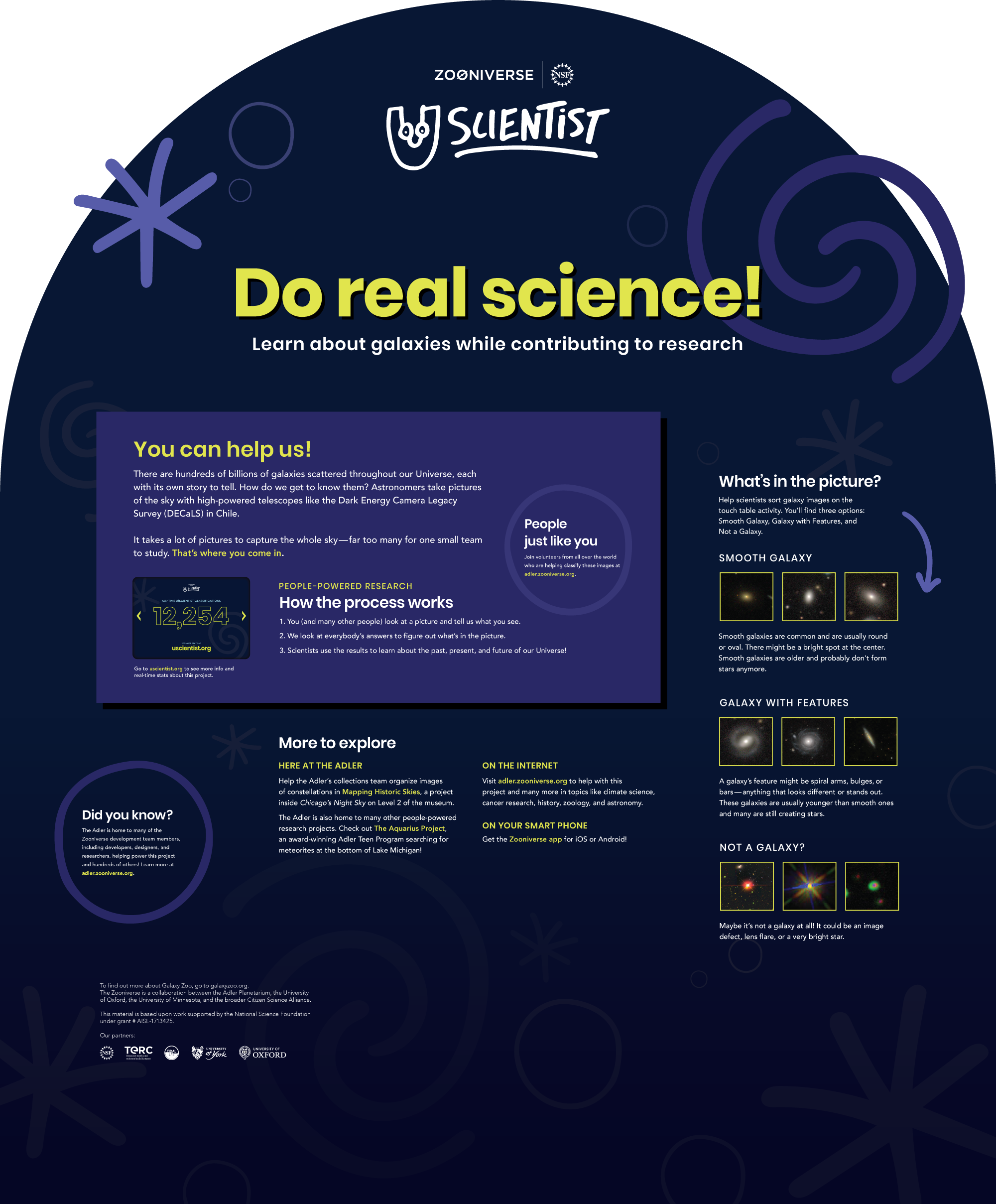

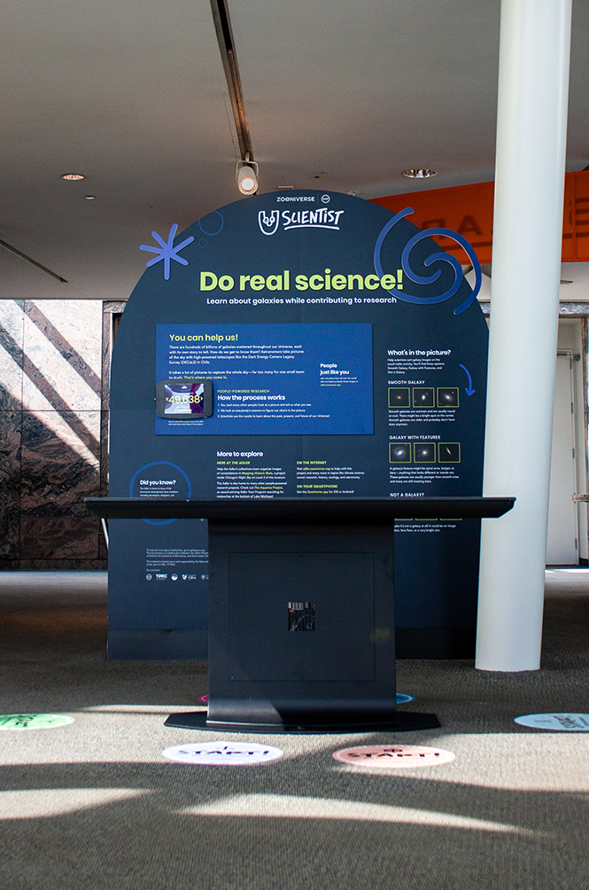
EXHIBIT DESIGN: This panel is situated slightly behind the touch table, serving as both a standalone informational panel about Zooniverse as well as directions for using the touch table. Because our research showed that proximity does not necessarily equal connection, the panel needed to visually match the touch table as well.